MAIN USER INTERFACE
The general layout of the user interface of ShotHub is similar to Pomfort’s desktop applications and consists of a header bar and the main UI showing either the clip view for Silverstack cloud projects, or the shot view for Livegrade cloud projects.
When using ShotHub on a mobile device the user interface is adapted depending on size and resolution of your mobile device’s screen.
HEADER BAR
The header bar consists of all top-level elements to navigate ShotHub. On the left you see the currently selected project and can access the project chooser to switch to other projects.
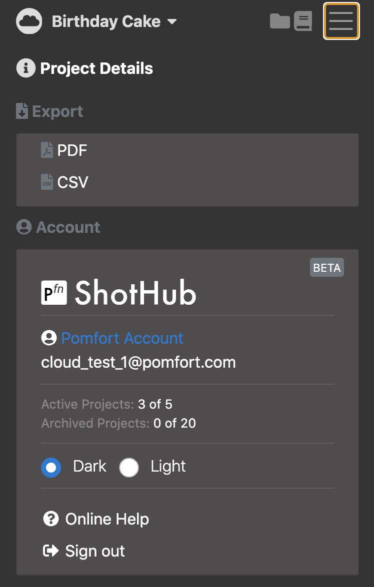
In the right corner you can access a menu combining several functions:
- The project info button opens the project information panel where you can manage the current project.
- Buttons to export reports of your clip metadata (Silverstack cloud projects only)
- Manage your account e.g. see pending invitations or switch between light and dark viewing theme.
MAIN UI
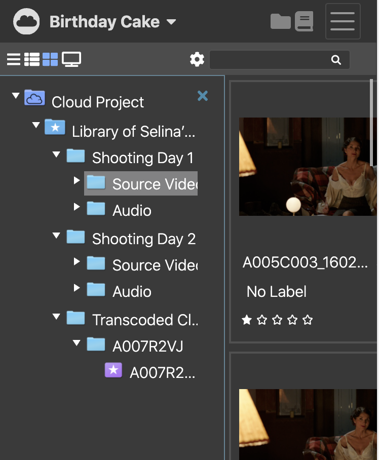
The main UI parts show the folders, bins, and clips contained by a project and is divided into three parts only one or two parts are shown simultaneously on a mobile device.
- The Content View is usually visible in the center and can be switched to different viewing modes to show statistics or a list of clips that are part of the selected item in the library outline.
- The Project Outline is shown via the folder icon and can be closed with [x]. The Project Outline is including all libraries from the desktop application that upload to ShotHub is shown.
- The Info Panel is opened with the file icon and can be closed with [x]. The Info Panel shows either metadata or details about storage locations of the selected item in the item list
Learn more: Silverstack Clip View, Livegrade Shot View
The post Mobile Device UI Overview appeared first on Pomfort Knowledge Base.